Home - Teleport Blog - Why We’re Updating Our Logo
Why We’re Updating Our Logo
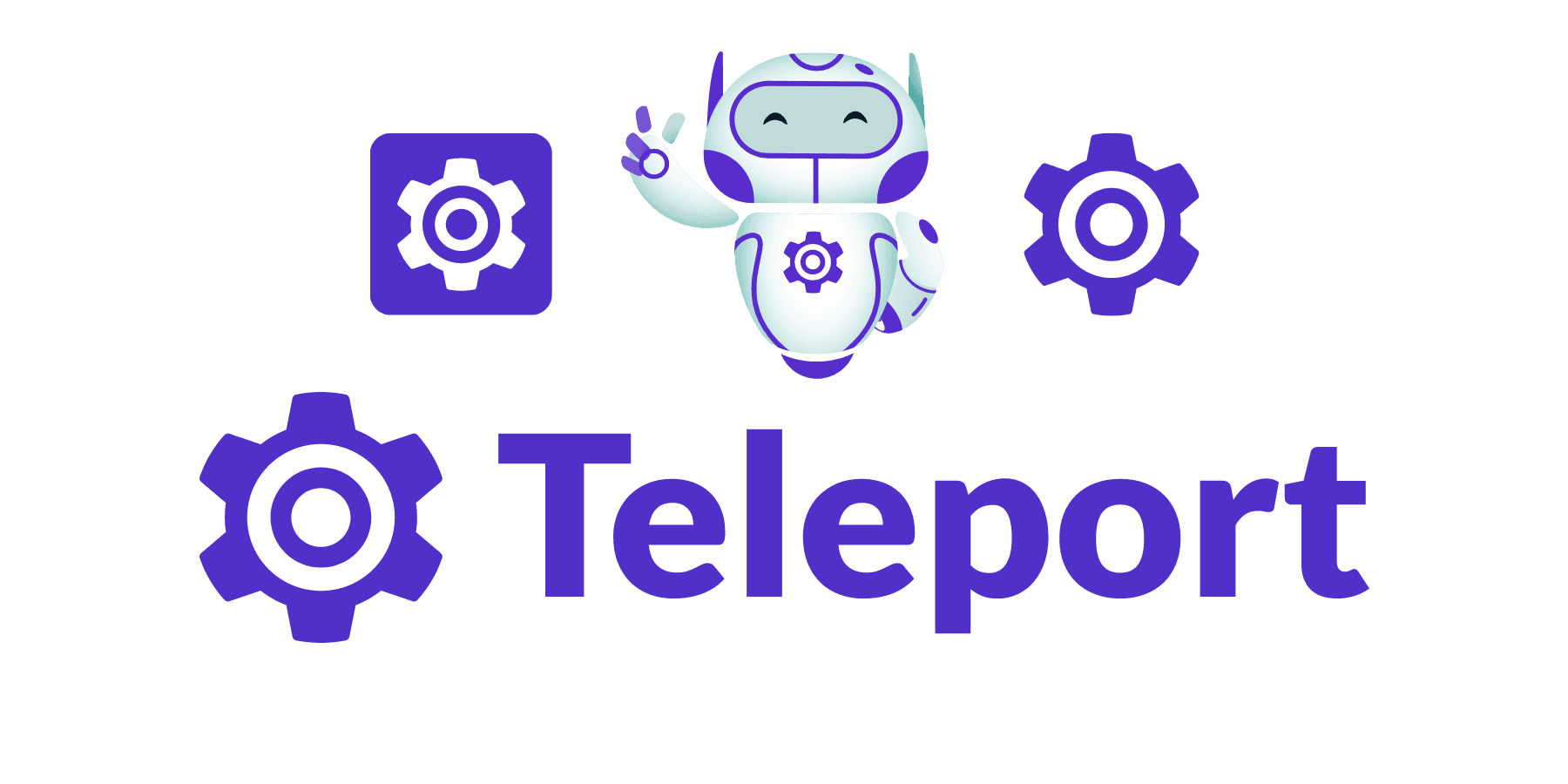
A logo starts its journey as a visual mark. With time, it comes to represent a company’s identity, values, and promises. As we continue to grow and evolve, we have decided to make a minor but important update to our logo. This change involves removing the letter "T" that sits at the center of our recognizable purple cog and replacing it with a visual element – a circle. Here’s why we’ve made this decision and what the new design stands for.


What we’re leaving behind
The letter "T" in our old logo has stood for many things: trust, technology, teamwork, transformation, and… Teleport. While these values remain central to our mission, we believe that a more abstract visual can better encapsulate the value we deliver to customers rather than an element that refers to our corporate name, which almost always accompanies the visual mark. We want the visual mark to represent you, our customers.
What we’re keeping
Having said that, we value the broad recognition and engagement of Teleport users. We are keeping the larger symbolic elements, form factor, and purple color intact, to preserve our logo as an easy to recognize symbol in the world of secure infrastructure access. Our outer circle is in the shape of a gear to show that Teleport is designed for builders and innovators in cybersecurity.
Why a circle?
At the heart of our updated logo is the inner circle. This powerful symbol represents:
- The Core of Our Mission: Bringing trust to computing.
- The Unification of Access, Identity, and Policy: As a fully integrated platform for secure infrastructure access.
- Innovative Security: Establishing zero trust connections between users, machines, and infrastructure resources.
- Customer-Centric Focus: Highlighting the central role our customers play in everything we do.
Celebrating our journey


Our logo update honors the milestones we’ve achieved and the challenges we’ve overcome. By replacing the "T" with a more abstract visual, we’re acknowledging our growth while staying true to our roots. The outer circle is a testament to our history and the inner one a beacon for our future. We’re excited to share this updated design with you and continue to build on the strong foundation we’ve established together. Thank you for being a part of our journey.
Need to update our logo in your materials? Download the new logo files here.
Teleport Newsletter
Stay up-to-date with the newest Teleport releases by subscribing to our monthly updates.
Tags

Subscribe to our newsletter

