Home - Teleport Blog - How I Found Myself in a Command Line vs. GUI Meeting
How I Found Myself in a Command Line vs. GUI Meeting
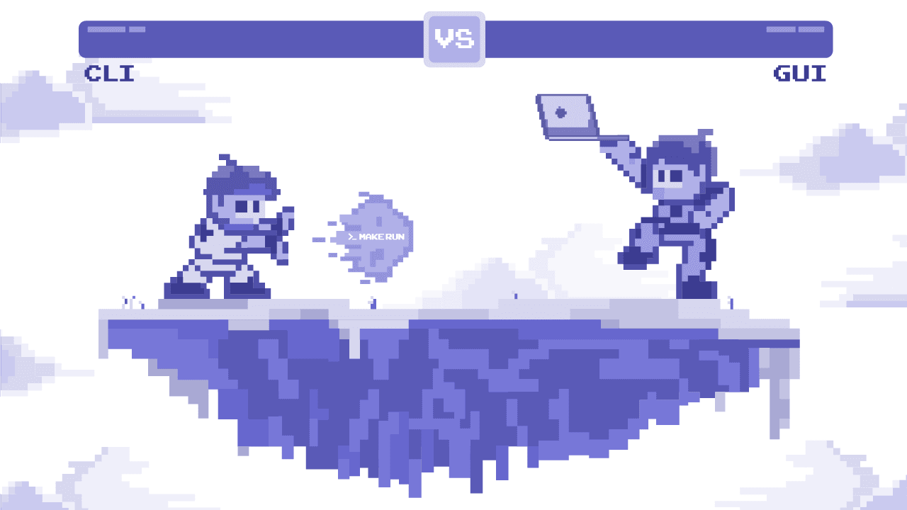
The Message on Slack
“Ev, do you have time later today to discuss the new web GUI for the command line terminal?” said the Slack message. It came from Alex, our user experience chief and the product in question is the SSH client.
Part of me was worried. The command line environment had a sanctuary where I found peace and happiness away from the world of browser-based tools. While friendly, this meeting invitation smelled of an “invasion” and I was conflicted, torn between my sincere desire to help Alex, with whom I’ve been working for almost 10 years, and my urge to defend my beloved CLI.
A bit of a background: the open-source project Alex has been working on is Teleport (think SSH on steroids) which also supports Kubernetes and (soon!) other infrastructure access protocols. Having a browser-based UI allowed us to say “Hey, it has the Windows and the iPad client too!” Besides, engineers appreciate the SSH-via-browser capability when using a computer without any SSH clients preinstalled.
Alex felt we had an opportunity to “revolutionize CLI,” and I wasn’t sure if I wanted it to be “revolutionized”.
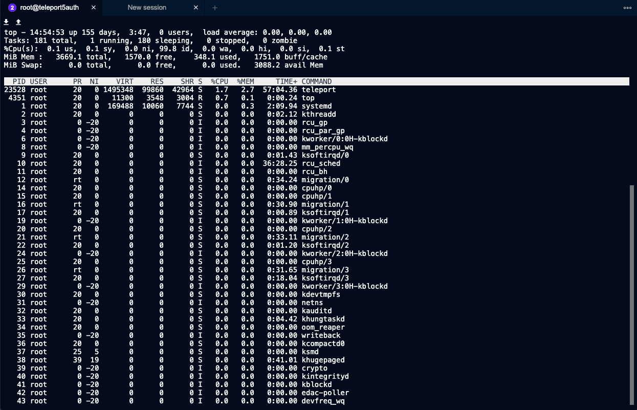
Trying to sound as friendly as I possibly could, I said: “Alex, the terminal does not really need a UI. It’s just a black box that applications can run inside of.”
I wanted to send him this screenshot:
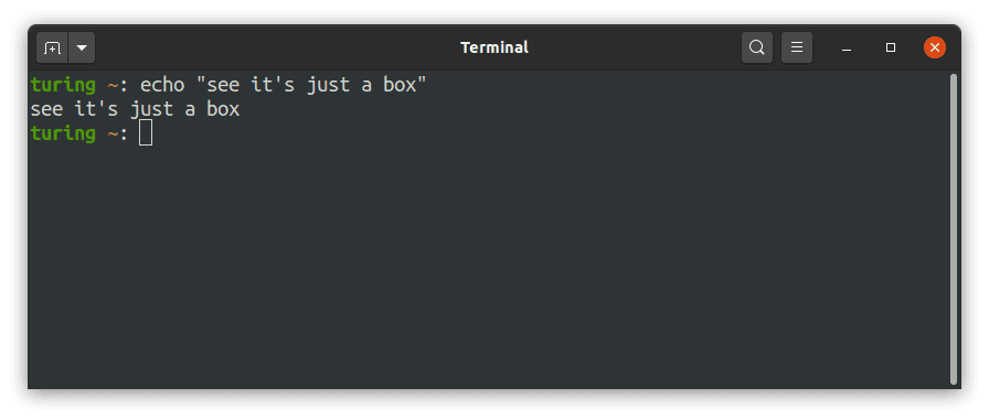

But instead, I accepted the meeting invite and made a list of suggestions.
My list was short:
- Let’s make sure the terminal window gets as much real estate as possible.
- There’s no need for white space around it. Every pixel counts, especially the vertical ones.
- All keyboard shortcuts need to be supported. Use the gnome-terminal or MacOS terminal as an inspiration, but also consider using a Raspberry Pi without a window manager for a weekend.
Everyone is a UI Expert
Feeling well-prepared, I showed up in our Zoom call. There were a few other engineers in the room. Some had managed Linux servers before, while others’ careers were more about programming. Some did back-end, others worked on front-end. There were different experience levels too, and the usual split of MacOS vs Linux. Finding a compromise within this group was next to impossible, as we found ourselves naturally grouping into three camps:
- Happy GUI users. Interestingly, these engineers were quite happy with browser-based programming (and system administration) in general. Let’s call them the “Web UI team”.
- The hard core “CLI team” who ran their terminals maximized most of the time and did not even use tabs, preferring to tmux for multi-tasking.
- Alex by himself on an island. He did not firmly belong to any camp, but held strong beliefs about user experience that he claimed to be universal, regardless of whether a user is an engineer or not.
Coming to an agreement took a lot of discussion. Apparently, we all care deeply about the UI and everyone has a strong opinion on how an CLI SSH client needs to behave. Eventually, we agreed on an implementation and you can scroll down to the bottom of this post to see the YouTube demo link.
But if you want to hear what options we’ve discussed, below are some of the questions that heated up that conversation.
The White Space Issue
One proposed design of the web-based terminal had the area surrounded by a lot of negative space, as is typical for Web UI’s. Even our old UI was a bit “guilty” of not being just a box:


And as we were discussing the ways to maximize usable terminal area and minimize the “chrome” around it, the Web UI folks kept calling Teleport an application. The CLI team would respond, saying that “an SSH client is not an application the user is running. The application is actually inside, so the client must be as invisible as possible.” Of course, both were right. We were just dealing with a lot of nested applications, each eating into the screen’s vertical space:
Desktop (top bar, sometimes the Dock)
   |---->Browser (window bar + tabs)
            |----> Teleport Web App (top nav bar)
                       |----> Emacs (CLI app)
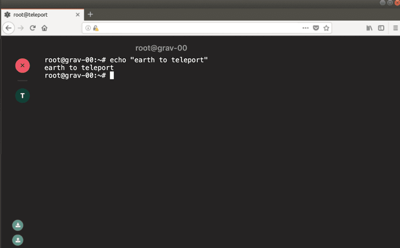

See how much vertical space an Emacs user is trading for the ability to access the box via a browser? For some screen sizes that would be 50% or more!
However, this is a table stakes tax everyone has to pay when designing a Web UI, and ultimately, we found no compromise here.
Scrolling came up as well: the Web UI team felt that having the terminal window partially visible is not that big of a deal, as every browser offers scrolling as a way to deal with partially visible content. But the CLI users would argue that the SSH client, again, must fade into the background and not interfere with applications inside (like Emacs).
In the end, we decided to launch terminal windows in separate browser tabs, giving them as much vertical real estate as possible within the browser. Plus, the working area of a terminal would always be equal to the browser page size, exactly how a OS-native terminal application would.
About Tabs...
The tabs themselves generated another difference of opinion. The Web UI group, pointing at successful web-based programming environments, was advocating for adding built-in tabbing, so a user could open new tabs by pressing something like Ctrl+Shift+T. They even used gnome-terminal and MacOS terminal as examples.
On the other side of the spectrum, the argument went, users already have two ways to create tabs: the browser itself offers tabbing and they can run tmux inside the existing terminal!
The question then becomes, what do you do if you’re in shell and you type exit? Do you close the Teleport tab and end up with a blank page in the browser? How would a user react to the browser page closing when they type exit? What if that was the last tab? Would you feel comfortable if your browser disappears as you type exit inside the black box on a webpage?
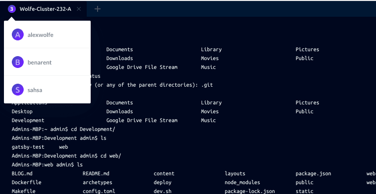
In the end, we decided to roll out our own built-in tabbing to address the following:
- Browsers’ built-in tabs work well for clicking on URLs, but if you’re inside of an SSH session, how do you tell the browser to open another tab for another machine?
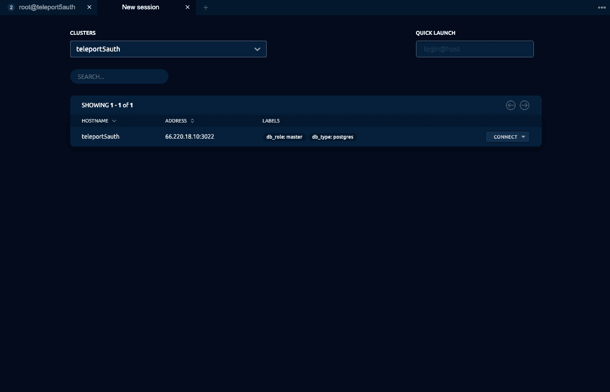

- Having our own tabs does not prevent users from using browser tabs as well.

- This gave us the ability to innovate: the tabbing mechanism we added offers features like seeing which servers are available, and you can even see if another user is logged into a machine you’re trying to SSH into!

About “Revolutionizing”
Did we revolutionize anything? No. Instead, we realized that the good ol’ terminal did not need much revolutionizing. But we did our best to keep everything that’s awesome about it and make most of it available inside a web browser.
Some of our ideas had no easy or obvious implementation. We are still chewing on them today. Here are a couple:
The Power of Clicking
If a user types ls inside a bash session in a web-based SSH client, why can’t they click on files that show up? If they could, clicking on any media file supported by the browser would allow you to play it. Then again, it isn’t really the purpose of an SSH client to do any of these things. We also need to consider security implications and how we know if what’s displayed is actually a file. After all, at the end of the day, a terminal is simply pushing stdin/stderr/stdout through without any understanding of what it is actually being transmitted.
Drag and Drop
Can I drop a file into a black terminal box and initiate a file transfer? SSH supports that. Let’s do SCP via a browser via drag and drop! But again, what are the security implications? What is the current directory you’ll be uploading to?
All of these questions were left without convincing answers, so we decided to play it safe.
But throughout these conversations, one theme was shining through. Very few of us were happy with the current limitations of the web platform.
My Own Web UI Frustrations
I’d argue that badly made GUIs are absolutely a nightmare. I started my career developing desktop software. Both Apple and Microsoft used to publish guides for building proper GUIs for their platforms. Our UX designers and PMs enforced those vigorously.
On Windows, for example, every feature had to be represented in the menu of the main window. By hovering over (not even clicking on) every menu item you could learn about the existence of every feature. Photoshop is still like that. There was logic behind those choices, and having standardized set of UI controls allowed users to learn the software much faster.
Modern web "applications" are crude by comparison. There's no standardized way to discover anything. Is it a button? Is it a dropdown? Is it just a strange background to display an error? Things auto-hide and auto-appear for no reason, you have to move a mouse around or practice every swipe variation ever. Hotkeys are an afterthought. Even resizing the browser or scrolling sometimes breaks things.
I am not going to name names, but we tried a web-based conferencing app a few years ago. The UI was so bad that nearly 30% of people could not figure out how to join. A way to join the call was the most basic thing that page needed to provide, yet the UX made even that impossible.
I am a CLI-first person, but there's no doubt in my mind that a well-done GUI can massively flatten the user’s learning curve for a new application. Being well done, however, requires a certain set of rules and conventions.
Why? Because:
- Not having them is expensive. Apple and Microsoft used to employ usability experts who’ve designed guidelines for everyone’s benefit. Today, if you want to build a first-class user experience, you’re starting from scratch every time.
- Speed of adoption. Pre-defined conventions accelerate user learning. Most Teleport users do not realize they can bookmark SSH sessions (recorded or active). Why? Because we have (mistakenly) relied on people’s ability to recognize that everything you see is a URL and a URL can be bookmarked. But because so many web applications violate this simple convention, users have stopped trusting URLs.
- Technical reasons. Faster loading times, smaller RAM consumption and longer battery life for everybody!
There are some exciting developments in browser technology. Web assembly comes to mind, but in addition to security and performance improvements, we need a more consistent and well adopted set of standards for reusable web components.
These web browser limitations largely guided our work with Teleport’s new UI. They caused heated discussions, lengthy arguments, and long-winded explanations, but we finished up with something we were all happy with.
Teleport cybersecurity blog posts and tech news
Every other week we'll send a newsletter with the latest cybersecurity news and Teleport updates.
Closing Words
So, what did we end up with? You can see the demo of the web-based SSH client on YouTube or even download and try it yourself.
That meeting took place several times and left a few scars! Alex even wrote his own blog post about it. But hey - in the end, we built something we all can be proud of. Feel free to suggest improvements on our Github page and, by the way, we’re hiring! So if you’re full of ideas on how to “revolutionize” what you see on Github, drop us a note.
Table Of Contents
Teleport Newsletter
Stay up-to-date with the newest Teleport releases by subscribing to our monthly updates.
Tags

Subscribe to our newsletter

