Home - Teleport Blog - Bridging the Gap Between Designers and Developers
Bridging the Gap Between Designers and Developers
Designing software is tough. Whether you're a designer, a product manager, or an engineer, we all play a major role in what the end user gets their hands on. Perhaps one of the most critical pieces on the journey to making great software is the relationship between designers and developers. When software is done right, it’s easy, intuitive, and a joy to use. This is no accident - it’s very intentional and it often takes countless iterations to get products to look and feel great.
In the recently [released Teleport 4.3] (/introducing-teleport-4-point-3-modern-replacement-for-openssh/), we have added a ton of new features and completely redesigned the user interface (UI). I’m going to discuss how and why it’s so important to create a healthy relationship between designers and developers and some techniques for doing so. This post simply scratches the surface, but the goal is to bring to light some important concepts that can make individuals more successful as a team.
A Bit of Background
Before we dive into the great things we did as a team when building Teleport 4.3, I’d like to quickly touch on the fundamental differences between designers and developers for those who may not be familiar with these roles and why there is a natural conflict. These differences are not set in stone, but include more of a general description of how designers and developers think differently about the same thing.
Designers are looking to push the boundaries of what’s possible, often with disregard for the difficulties of implementation. As a designer I don’t just focus on what’s functional, I also think about what is going to make our users happy. Nobody wants to use your software, they have to use it to get their job done. Understanding this creates empathy for a user and gives you a desire to make things painless and enjoyable. I often push to create the simplest user experience possible, even if it means more work for the team. I’ve always felt it’s our job to accept great challenges and build something that gives our users great satisfaction. That’s what we are paid to do.
Developers are responsible for engineering the product. They are constantly thinking about the time, cost, and feasibility of implementing each and every single feature. Developers often get pressure from different groups (like product, marketing, and sales) to ship a completed product and add new features. Most other departments are not aware of the technical requirements for building new features and products. There is constant pressure to just, “hurry up and ship it already.” For example, our marketing team usually has blog posts, web pages, emails, and other items all setup to go out on a certain date. When dates slip, everything needs to be readjusted. Similarly, Sales has customers waiting on new releases with features they have promised existing or potential customers. These pressures are very real.
Getting the MVP (Minimum Viable Product) out the door is often a priority for developers since they want to ship fast and iterate quickly to relieve pressure from other departments and get people using the product. Adding on too many additional features or requirements can drag out development time, create coding debt by deprioritizing code quality, and reduce the amount of testing, given time constraints.
Bridging the Gap Between
When you think of goals for designers and developers, you probably think that they are very different. After all, one creates the visual design, UX, and user flows while the other builds the product based on the available technology, technical constraints, and time availability. It turns out their goals should be the same: creating great products!
Engineering is not an exercise in engineering for engineering’s sake and neither is design. Programming, designing, UX, technical competence, etc. are all merely the tools we use to achieve the same goal: creating great products that our users will love.
Below are a handful of strategies to bridge the gap between designers and engineers and create stronger, happier, and more effective teams. We used these techniques for collaborative success while building Teleport 4.3 and we continue to use them everyday.
-
Teach each other. I see myself as a teacher just as much as a designer. For someone to understand and appreciate a design decision, you must break down exactly what you did and why. It’s an opportunity to improve your team. I want the development team I work with to understand and love design deeply. This can only happen if I’m willing to take the time and teach them everything I possibly can. It makes us a team that doesn’t identify so much with our role as our goals and principles. This is the same for developers. Teaching their design team complex technical principles goes a long way. It helps designers make better user experiences based on reality, not just imagination.
-
Become one team. This is your team. Repeat after me: this is your team! Screw all that bullshit that you’re on the design team and someone else is on the engineering team. Are you working on the same product? Then you’re on the same team! The people with whom I work most closely are the engineers. We learn from each other, share ideas, argue about features, look at wireframes/flows, discuss technical issues, and on and on. You cannot create great products when you don’t truly work together. UX is not sprinkled on at the end of development, that’s called lipstick on a pig. In order to make something great, you have to have a great team. That requires working together!
-
Work together from the start. “We’ll bring design in at the end...or...We’ll talk to the developers when we finish the design” are both ways to ensure your product and teams suck. When I’m designing I start with wireframes and prototypes (we like using Balsamiq Cloud). I iterate rapidly and get together with my team (Product managers and engineers) to review the UI, poke holes in it, uncover technical issues, or use cases I didn’t think of. It's a team effort that needs all eyes. The final results is a wireframe that is a collaboration of our experience and skills. I consider this “our” work because that’s exactly what it is. The process doesn't stop there; it simply continues with high fidelity designs (Usually with Figma or Sketch), design specs, alpha versions of the product and so on. We are all involved in this process and deliver these items as a team.
-
Be Flexible and Iterate. As a designer who is also a developer, I’ve learned a valuable technique that saves time and results in a better product. Sometimes it's ok to ship now and perfect later. Your design files don’t need pixel-perfect for items like buttons or other UI elements. Making fine tune adjustments in the browser, or mobile device is often faster and results in a better design. Designing on the fly is often necessary when building products because things simply look different in Figma, Sketch, Photoshop, etc., than they do in real life. This is also true when you’re cutting features or figuring out areas of a user flow that are unfinished. Sometimes you can para-program and design with your dev team mate. This results in a much better connection with your team, some great ideas, and it’s pretty darn fun.
-
Test your assumptions. Getting into an endless loop about who is right and who is wrong doesn’t do any good. Neither party is likely to agree unconditionally with the other. Instead of looking at this as a negative, understand that it comes from a place of passion. You need passion to create great products. No passion, no breakthrough product. But put your passion into discovery - being stubborn about an assumption doesn’t help when you aren’t willing to test it or be wrong. I'll say to my team, “I think this would be the best outcome, but we’ll need to test it.” Or sometimes I’ll simply say, “I don’t know, we’ll need to find out.” Admitting you don’t know something is a sign of strength and experience.
Ship, Test, Fix, Repeat...
We recently shipped Teleport 4.3, a new version of Teleport that was packed full of features including an improved UI that allows us to surface features that were hidden. Best of all, 4.3 is flexible enough to add new features in the future. See the Teleport demo of the new UI.
Building Teleport 4.3 was tough! We worked together tirelessly to get this product out the door. We reviewed countless designs, made tons of iterations, argued for hours and hours about features and flows, changed designs again and again, stayed up late, got up early, broke things, fixed things, and wrote an insane amount of code. I loved every minute of it. All of that hard work was the cost of creating something great, something I’m proud to have been a part of. We became a stronger and better team during this process and we continue to grow and learn from each other.
Shipping a product is just the beginning. We’re not done yet, and we never will be. We’ve been conducting usability testing and user feedback sessions so we can learn more about how our customers are using this new version of the product in the wild. We love what we’ve done so far but know we can make it even better. Our design and development teams are working together just as much as before to improve the user experience of our product. It's important to make sure you collaborate just as much after you launch a product as you do when building it, this is often the most critical time for gathering real feedback.
If you try it out, please let us know what you think. You can reach out to me personally with feedback you have that will improve the product. [email protected].
Teleport cybersecurity blog posts and tech news
Every other week we'll send a newsletter with the latest cybersecurity news and Teleport updates.
Presenting Teleport 4.3
To conclude this article I’d like to present Teleport 4.3, a true labor of love from a team that is passionate about creating amazing products. Thanks for reading and good luck building amazing teams and amazing products. Enjoy!
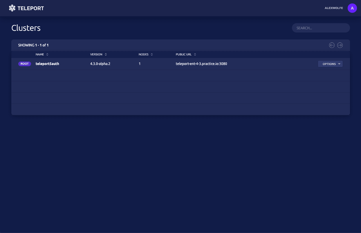

A new clusters management screen that allows users to search and manage clusters at scale. Previously this was a dropdown menu causing major UX issues
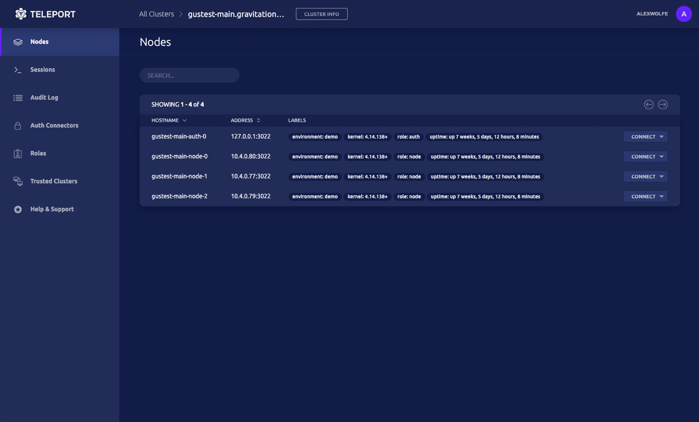

A complete new design for clusters. We chose a dark mode however we built in theming so in the future we will have a light mode and even custom themes. Our side navigation for clusters now exposes all areas available to a user for easy access with clear labels better usability
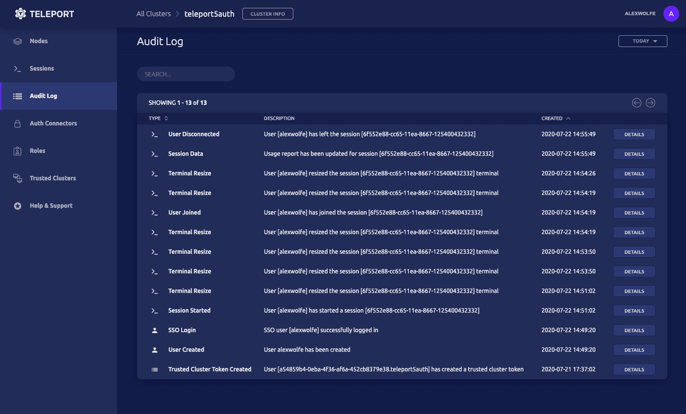

Teleport 4.3 exposes the Audit Log within the UI. Users can now view a detailed audit log from within the UI along with session playback.
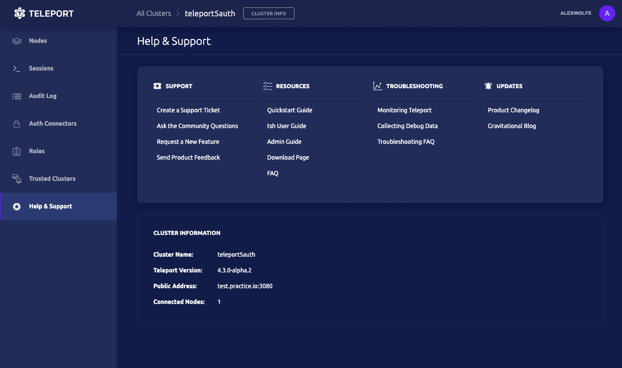

We built in help and support right into the user interface. This makes it easier for users to find support documentation, resources, and troubleshoot their problems.
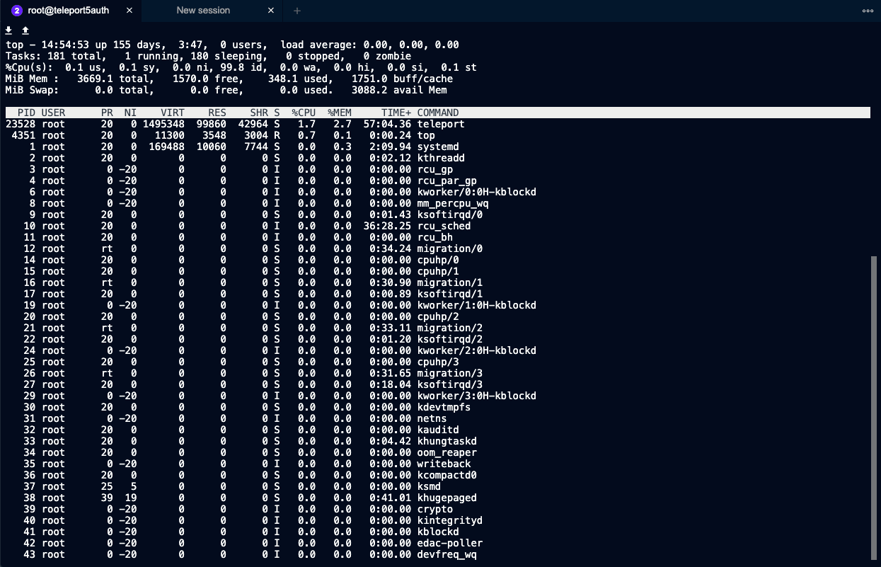

A brand new stand alone terminal. This terminal has been redesigned to feel more native to users by maximizing the use of space. It also allows for multiple sessions by opening new tabs within an existing session.
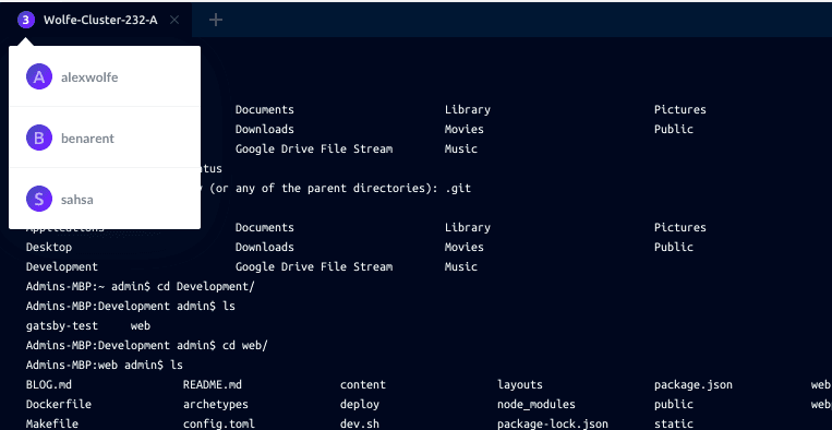

Each tab now displays the number of users in a session with information about that user when you hover over the number badge.
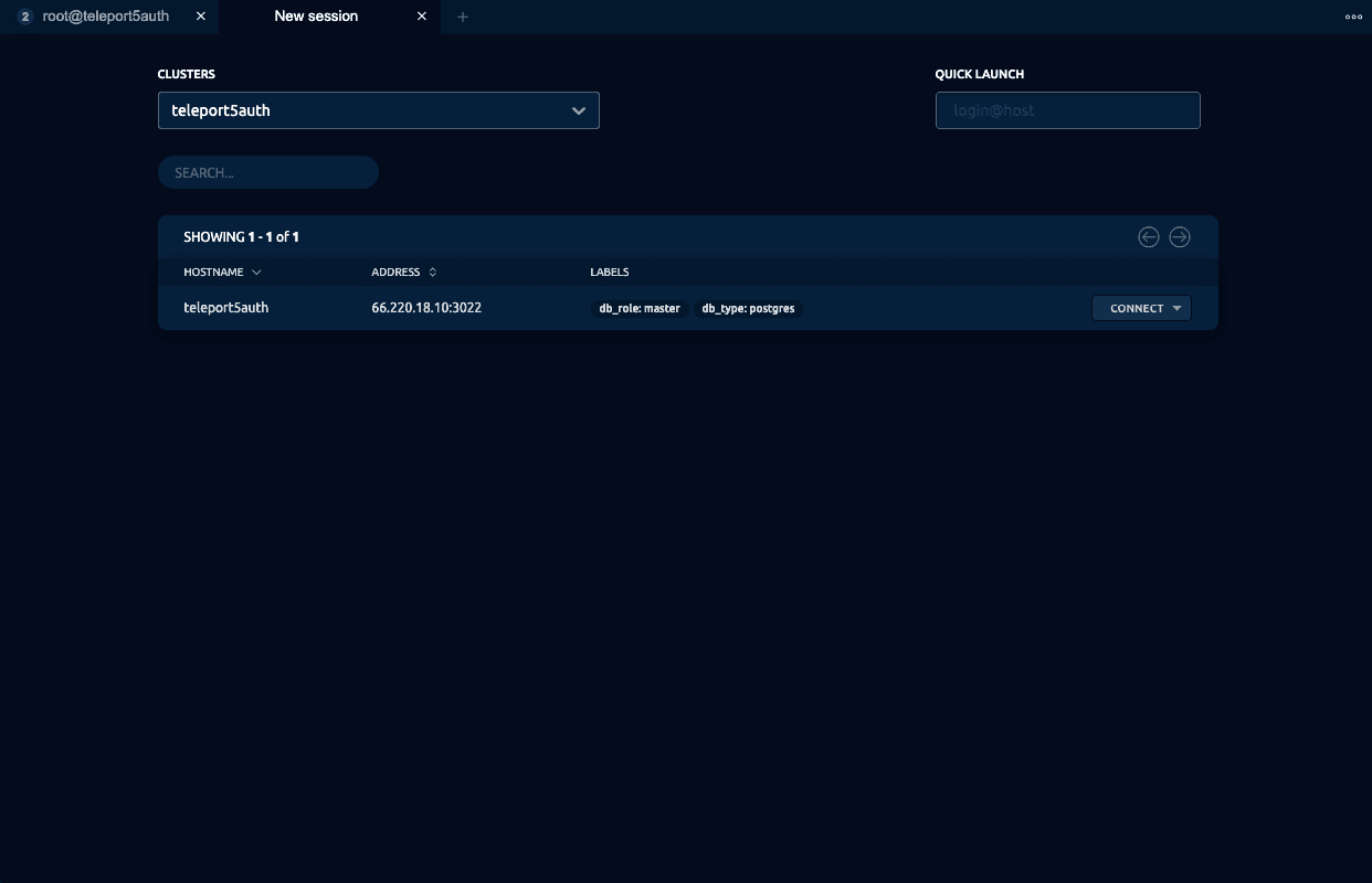

The terminal can be used as a stand alone application allowing users to switch between clusters and search for nodes they want to initiate a session on.
This is just a brief highlight of some new features in Teleport 4.3. Watch a short demo of Teleport and try out Teleport 4.3 for free by downloading it today. Enjoy!
Table Of Contents
Teleport Newsletter
Stay up-to-date with the newest Teleport releases by subscribing to our monthly updates.
Tags

Subscribe to our newsletter
